


Recent hot afternoons have made it feel like summer has been here for a while, but we officially welcome in the new season on Wednesday at 10:57 a.m. ET with the summer solstice.
The summer solstice marks the moment that the Earth’s axis has its greatest tilt toward the sun- and when the sun is directly overhead at the Tropic of Cancer. It is the longest day of the year in the Northern Hemisphere.
Now is an opportune time to be reminded that summer can bring the harshest effects of a warming climate, such as heat waves, poor air quality and stronger hurricanes.
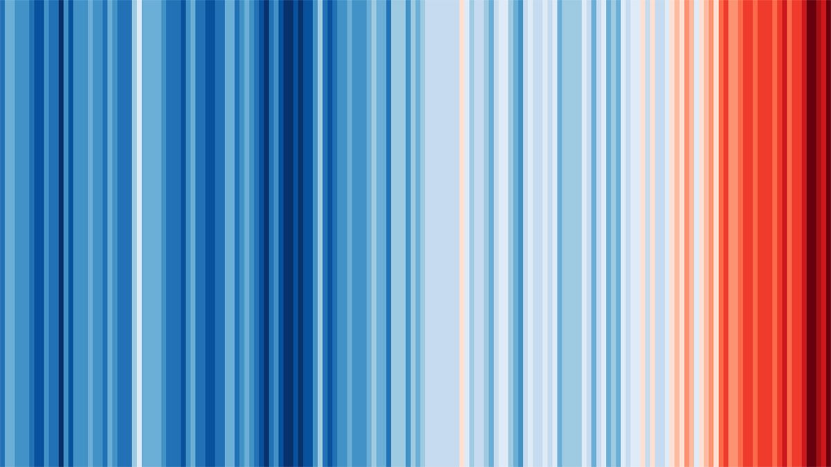
As a way to call attention to how the Earth’s climate has been changing, University of Reading, England climate scientist Ed Hawkins devised a unique way to visualize the warming pattern: through a simple image of stripes.
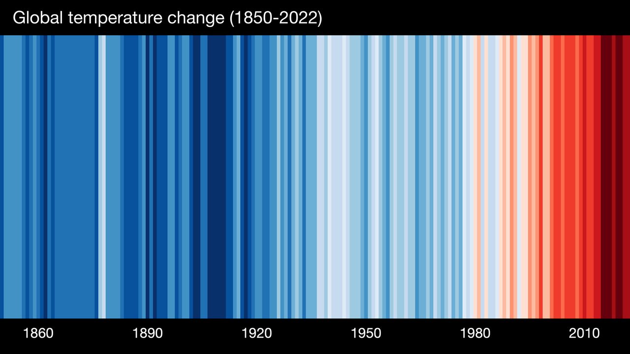
With blue representing cooler and red representing warmer, each line symbolizes how the yearly temperature has deviated from the 20th century average.
At a quick glance, it is clear to see that fluctuation occurs over time, but recent years have trended warmer.
In an email, Hawkins wrote, “the warming stripes start conversations. Their simplicity means they have been used in so many different creative ways to communicate about climate change, especially to diverse groups who may not normally be exposed to such information.”
The stripes have developed international popularity; Hawkins uses his Twitter account to share the unique way the stripes have been shown worldwide.
Bernadette Woods Placky is the chief meteorologist for Climate Central, a non-profit group. She shared the wide range of how the stripes have been displayed.
“The image has become a symbol of inspiration and hope, sparking so many conversations about climate change—from teachers wallpapering their classroom and face mask coverings, to a German train station design, a finance CEO's scarf, and the cover of the Economist,” said Woods Placky.
The stripes have especially gained popularity with broadcast meteorologists in the United States.
Jeff Berardelli is one of those meteorologists, leading the way by organizing the annual #ShowYourStripes day on or around the summer solstice. It is an opportunity to share local stripes with viewers.
“Hawkins’ Warming Stripes are a great example, extremely effective communication, where less is more. With one glance, a person can see how quickly things are changing and temperatures are warming due to the actions of humanity. It’s why the visual has become an international symbol of climate change,” said Berardelli.
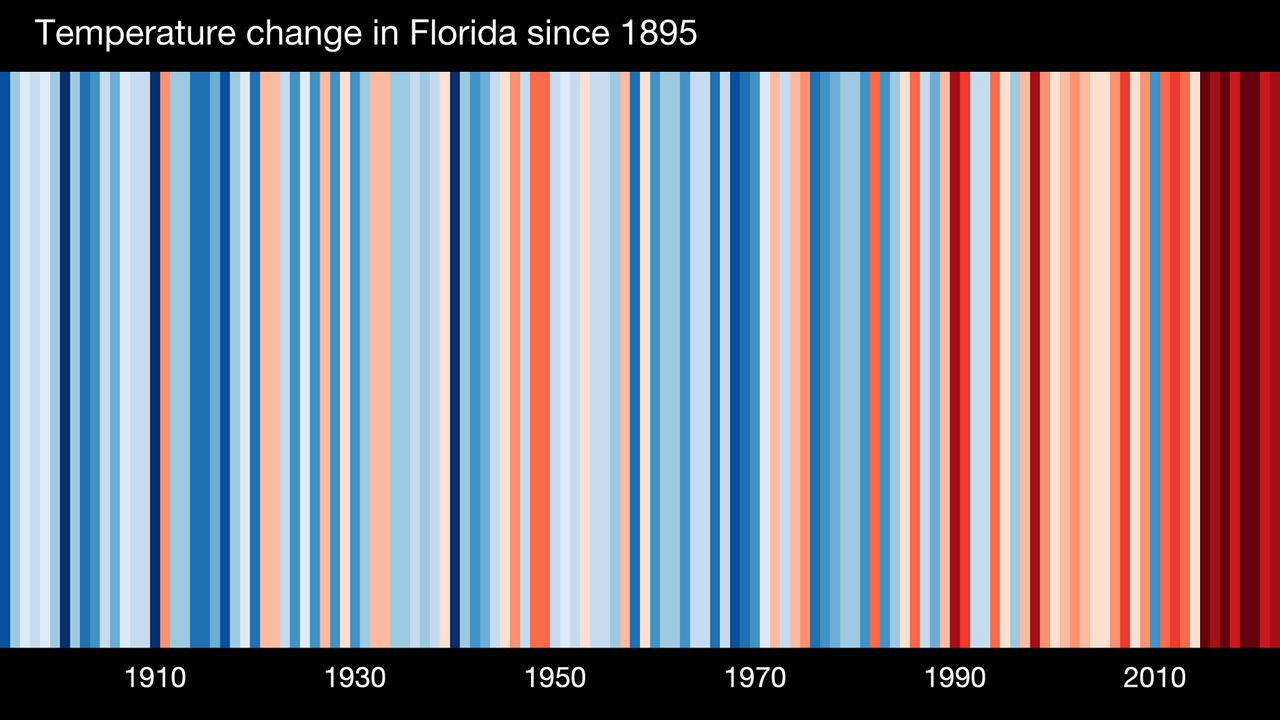
Here in Florida, the statewide data represents the NOAA average annual temperature anomalies from 1895 to 2022, which have been trending warmer in recent years.
You can look up stripes for countries worldwide and for hundreds of United States cities to see how the local climate has changed.
Hawkins stated, “We have made them freely to download so they can be used as widely as possible to tell important stories about how the climate is changing globally and locally.”
Our team of meteorologists dives deep into the science of weather and breaks down timely weather data and information. To view more weather and climate stories, check out our weather blogs section.